Peaks, Valleys and wrong-turns - presenting time series data in analytics applications
 There are many ways to fail when presenting time series data. I am going to start by assuming your data is clean and in order. This is, of course, non-trivial. This post focuses on the presentation issues.
1) Is your data smooth or jagged?
If the performance of what you are measuring is continuous (staffing levels, minutes) rather than episodic (sales $, calls, hits) then the sampled data should not be that jagged unless the sampling interval is too long or there is a step-function somewhere in how things are measured. If the data is episodic, the reverse can happen - too short a sample makes things very noisy/jagged.
2) Has the data already been smoothed?
Regressions, moving averages, or any type of curve fitting can alter the data significantly. Many tools allow zooming in on exact values. If you then apply any other aggregation to the data, what you present will be quite flawed.
3) Is the graph being used for identification of new issues or validation of trends? What decisions are being made with the graphs?
All visualization needs to be aligned to specific business processes - you must know what the intended use of the graph is to make sure the data and visualization support that decision. Often, process owners will not separate the key issue of outlier identification. As a result, when aggregated data are then graphed, the outliers become obscured. Both the drawing of the graph and then resizing for screen format changes how the data are displayed - Does the graph then support the intended business process?
4) Can business logic be substituted for the graph?
If the graph is showing queue wait time, can you instead show only the out of compliance times? Maybe a table with event start and duration might be more useful than a graph.
5) Can you test the effectiveness of the graph?
Is it effective? Do you have test data and subjects who can recognize the patterns the graph is intended to display?
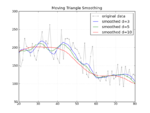
In these examples, the graphs show the amount of water in a tank, measured every minute, summarized into 30 minute averages with a modest amount of smoothing. A water system fills the tank. The tank then empties when water is used or if there is a leak. The graphs are analyzed to understand overall system performance or sub-system performance - and to make sure there is enough water on hand.
Don't do this:

This takes continuous data (water level) which is collected each minute and then aggregated into 30 minute intervals then applies a smoothing algorithm to the data - a 6 hour moving average. Then the graph itself interpolates between the values to create the line. The graph above looks better than others without smoothing but can be misleading for some applications.
Assuming you know the lineage of the data, understand the reference data and can bring some consistency to the overall transformations, how do you make sure it doesn't fall apart on the last mile?
Option 1: Don't provide discovery or even much visualization if the data can't support it
 It may be that the data isn't that clean and it takes substantial effort to make sense of it. Even then, maybe your error rates are unknown. If everything is good but you can't say how good, just show it's good...
Option 2: All your users to change granularity
Biasing towards delivering more data points rather than less allows your users to find the outliers. The graph above isn't very good at showing trends but at least the users can narrow in on a range to make their own suppositions. It's certainly not quick.
Option 3: Smooth but display error rate
Here we display the error rate and also allow for zoom in. Now the trend is clear but the upper and lower ranges of the smoothing are also clear to help resist invalid interpretation.
Option 4: Display Variances Only
In this final example, only the outliers are show - all data that is "normal" is just excluded (the normal range is assumed to be 35000-36000. The 6-hour moving average is shown but then the variance between the moving average and observed value is recorded. The standard deviation of those differences is then shown - 66% of all actual values will fall between the upper and lower line.) This was done quickly but I think can often be superior to a simple spark lines for at a glance info. Take your error rate plus a filter and see if just reporting exceptions results in too much lag. An awful lot of pixels and screen go into displaying data that has no action at all.
Prescription for analytic applications using visualization
Know the business process for each visualization. Who are the users and what they do with the information.
Understand the lineage of the data - what are your errors and error rates, what error rates are acceptable given the process you are supporting.
Find data that shows the outer ranges of acceptable actions that are being measured, drive that into a test set to make sure it still shows from source all the way through to visualization.
Don't just model on aggregates, model the underlying data. (This may be hard to impossible for large data sets and client site graphing tools but at least recognize that you are introducing errors if you use any smoothing or aggregation in the graphing tool.)
Understand how your graphing package interpolates and make sure that doesn't invalidate your business case (or maybe you have to make the graphs fixed size.)
Show error + lineage information whenever possible, drill down to reference data if possible.
Read Tufte!
;)